The best double-sided language flashcards put one clear prompt on the front and one controlled answer on the back. Decide first whether the learner should recognize a foreign-language word or produce it from a translation, image or definition. That direction determines where the word, pronunciation, translation and example sentence belong.
For most vocabulary decks, use large prompt text on the front and reserve the reverse for feedback: the answer, pronunciation support and one short example. Avoid turning both sides into miniature textbook pages. A learner should understand the task immediately, attempt an answer and confirm it with one flip.
Choose the learning direction before the layout
A target-language prompt on the front and a first-language translation on the back mainly practices recognition. Reversing that arrangement makes the learner retrieve and produce the target-language word, which is generally more demanding. Reviews of adult second-language vocabulary studies also distinguish retrieval practice from simple repetition and report stronger results for retrieval practice in the experiments examined. The Cambridge review of vocabulary-training studies provides useful background on these learning directions.
One physical card cannot test both directions during the same flip-and-check pass. Printing “la ventana” on the front and “the window” on the back tests Spanish-to-English recognition when used as printed. Turning the deck over tests English-to-Spanish recall only if the card order, orientation and surrounding cards do not reveal answers unintentionally. A deck intended for systematic practice in both directions works better with two linked cards per item or two clearly defined review modes.
Choose one primary direction for the first edition. Beginners may benefit from target language to familiar-language meaning because the task feels approachable. A speaking-focused deck should usually lead with the familiar-language meaning, an image or a short situation and ask for the target-language expression.
| Learning goal | Front prompt | Back feedback | Best content emphasis |
|---|---|---|---|
| Recognition | Target-language word or phrase | Translation and example | Fast meaning checks |
| Active recall | Translation, definition or image | Target-language answer | Spelling and production |
| Pronunciation practice | Meaning or image | Word plus pronunciation support | Retrieve before checking sound cues |
| Sentence building | Word, situation or sentence gap | Completed example and translation | Usage and grammar |
| Concrete beginner vocabulary | Clear object or action image | Word, article and translation | Direct image-word association |
Build a strict information hierarchy
Give every card the same content roles. The front needs a prompt, not an answer disguised by extra hints. The back needs enough information to correct the learner without introducing several unrelated facts. A dependable structure is:
- Front: one word, short phrase, definition, image or sentence gap.
- Back, first line: the exact target answer in the largest type.
- Back, second line: translation or concise meaning.
- Back, third line: pronunciation, grammatical gender, part of speech or another essential form.
- Back, final line: one short example sentence, with an optional translation in smaller type.
Apply those fields selectively. A Spanish noun card might show “window” on the front, then “la ventana,” a pronunciation aid and “Abre la ventana” on the back. A Japanese verb card may need its reading and a polite form. A phrase deck may need register labels such as formal, informal or regional. If a field does not help the learner retrieve or verify the answer, remove it.
Pronunciation belongs primarily with the feedback. Showing a complete phonetic transcription on the prompt side can make the exercise easier than intended. Research comparing pronunciation-training methods found benefits when learners retrieved and produced a second-language word before receiving corrective feedback rather than imitating it immediately. Printed notation or a separate audio reference can support that feedback stage without replacing recall.
Use example sentences without crowding the card
An example sentence should clarify normal usage, not display every possible meaning. Keep it short enough to read at arm’s length and feature the target word in a predictable location. For inflected languages, select a sentence that demonstrates the form learners actually need. For phrases, show a natural exchange or situation rather than an isolated dictionary definition.
Use one example on the card and place additional examples in a companion sheet or digital resource. Multiple sentences shrink the type, weaken the answer hierarchy and make quick review feel like close reading. If two meanings are common and substantially different, create separate numbered cards rather than squeezing both onto one reverse.
Reserve images for words they explain precisely
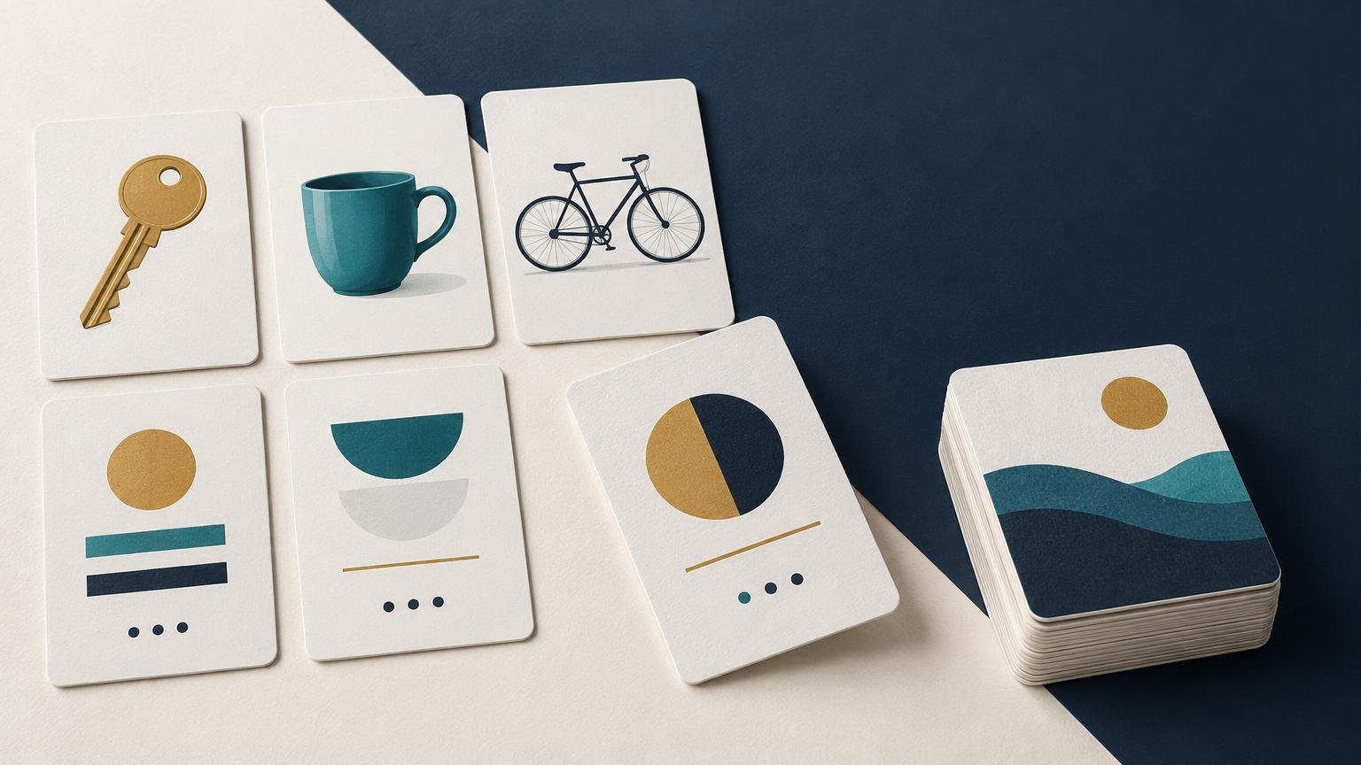
Images work best for concrete nouns, visible actions, foods, animals, objects and places. A clear drawing of a bicycle can replace a first-language prompt and encourage direct retrieval. An abstract term, grammatical particle or expression of register usually needs a concise definition, contrast or sentence instead.
This distinction matters because pictures are not automatically helpful. A vocabulary-learning study found that illustrations supported concrete words while simple illustrations hindered learning of abstract words; it also characterized the wider evidence as mixed. The published vocabulary-illustration study supports treating imagery as a targeted teaching device rather than universal decoration.
Keep instructional images visually simple. Busy photographs create ambiguous prompts, while decorative backgrounds compete with words and pronunciation marks. If text sits over color or photography, check its contrast carefully. The W3C contrast guidance specifies ratios of at least 4.5:1 for normal text and 3:1 for large-scale text. Those criteria address visual presentation rather than print production specifically, but they provide a useful benchmark for small flashcard copy.
Choose a size that fits the content
A 2.5 × 3.5-inch card is portable and comfortable for rapid drilling, but it rewards disciplined copy. It suits a word, translation and short example. A 3 × 5-inch card gives pronunciation, grammar notes and sentences more breathing room. A 4 × 6-inch format is useful for classrooms, demonstrations or image-led activities, though a thick deck becomes bulky.
These dimensions are conventions, not universal standards. Commercial options also include formats around 58 × 88 mm, 59 × 92 mm, 70 × 100 mm and 70 × 105 mm. Before designing the complete deck, print representative cards at actual size on an office printer. Include the longest word, the densest example and any small pronunciation marks in the test.
For a handheld study deck, a smooth matte or silk-coated stock is a practical default because it supports color artwork without the strong reflections associated with glossy surfaces. Choose uncoated stock when learners need to write answers or annotations directly on the cards. Rounded corners are comfortable for frequently handled decks and resist obvious corner wear, while square corners may suit larger classroom cards that are handled less intensively.
Stock labels require care. Terms such as 14 pt, 16 pt, 100 lb cover, 130 lb cover and 350 gsm describe different measurements or supplier systems; they are not direct equivalents. Thickness, fiber, coating and construction all affect stiffness and feel. Request a physical sample or production proof instead of selecting by one number alone.
Prepare uniquely paired fronts and backs
Vocabulary cards normally need a unique reverse for every prompt. A shared decorative back works for playing cards, but it cannot carry an individual translation or answer. Confirm that the printer supports unique front-and-back pairing for the full deck before placing an order.
Build a simple data table with one row per card and separate columns for card ID, front prompt, back answer, pronunciation, translation, example, image filename and notes. Stable IDs such as ES-001 prevent a corrected answer from being paired with the wrong prompt. Export the deck in the printer’s requested order; duplex workflows may require one multipage PDF, separate front and back files, or alternating pages.
Extend artwork or background color through the required bleed. A 0.125-inch, or approximately 3 mm, bleed is a common convention, but the printer’s template controls. Bleed gives the cutting process extra image area and helps prevent white slivers at an edge. Adobe’s explanation of print bleed shows how that area functions in page-layout files.
Keep words, accents, phonetic marks and card numbers inside the specified safe area. Avoid thin, equal-width borders near the trim line because ordinary cutting variation makes small shifts conspicuous. Full-bleed color or artwork without a precision frame is more forgiving.
Proof the learning system as well as the printing
Order or make a short prototype before committing to the full quantity. Shuffle it, read it under typical room lighting and ask a learner to complete a real review session. Check whether the prompt gives away the answer, whether the reverse resolves uncertainty quickly and whether cards remain correctly oriented after flipping.
- Test the longest words and smallest pronunciation marks at finished size.
- Confirm every front is paired with the intended back by card ID.
- Check accents, non-Latin characters and font embedding in the exported PDF.
- Verify that examples use the intended meaning, register and grammatical form.
- Inspect contrast on both screen and a physical proof.
- Confirm bleed, safe area, corner radius and page sequence against the printer’s template.
- Compare total cost using card count, quantity, proofing, packaging and delivery rather than deck price alone. The custom card printing cost guide explains these variables in more detail.
If the deck belongs to a wider teaching kit with worksheets, posters or other printed pieces, Printiverse is a useful starting point for those general custom-printing needs. Keep the flashcard specification centered on repeated handling, legible type and reliable answer pairing.
Start with one complete sample card
Design the hardest card first: the longest prompt, a pronunciation line, an example sentence and any required image. Print it at finished size, simplify it until the hierarchy is obvious, and then use that structure across the deck. Once the content template works, lock the learning direction and card IDs before preparing the duplex production file. That sequence produces language flashcards that are easier to study, easier to proof and much harder to mispair.
Frequently Asked Questions
What should go on the front of a language flashcard?
Use one clear prompt: a target-language word, translation, definition, image or sentence gap. Choose the prompt according to the skill the learner needs to practice.
What should go on the back of the card?
Lead with the exact answer in the largest type, followed by only the translation, pronunciation, grammar detail or short example needed to verify it.
Which card direction is best for active recall?
Put the familiar-language meaning, image or definition on the front and require the learner to produce the target-language word. This is more demanding than recognizing a target-language prompt.
Can one double-sided card practice both directions?
Not in one flip-and-check pass. For systematic practice in both directions, use linked reverse-direction cards or establish two review modes that do not reveal answers unintentionally.
Should pronunciation appear on the front or back?
Usually place it on the back as feedback. A complete pronunciation cue on the front can reveal too much before the learner attempts retrieval.
How many example sentences should each card include?
Use one short sentence that demonstrates the intended meaning, register or grammatical form. Put extra examples in a companion resource or split substantially different meanings into separate cards.
When should language flashcards use images?
Use clear images for concrete objects, actions, foods, animals and places. Abstract words, particles and register distinctions usually need a definition, contrast or sentence instead.
What size works well for a handheld vocabulary deck?
A 2.5 × 3.5-inch card suits a word, translation and short example. Choose 3 × 5 inches when pronunciation, grammar notes or longer sentences need more room.
How should paired fronts and backs be prepared for printing?
Assign every card a stable ID, keep front and back content in the same data row, and confirm the printer’s required page sequence. Also check bleed, safe area, font embedding and every pairing against a physical proof.
References
- A REVIEW OF LABORATORY STUDIES OF ADULT SECOND LANGUAGE VOCABULARY TRAINING | Studies in Second Language Acquisition | Cambridge Core
- TESL-EJ
Teaching English as a Second or Foreign - Psychon Bull Rev (2013) 20:1259–1265
- Understanding Success Criterion 1.4.3: Contrast (Minimum) | WAI | W3C
- Custom Flash Cards and Trading Cards | Recycled Stock
- Flashcard printing: your own learning cards, from one set | Printedin
- Custom Cue Cards & Flashcards Printing | TV & Presentation
- Print bleed and slug areas in InDesign | InDesign
- Card Deck Setup Guides – PrintNinja